10 years of The Day Is My Enemy: Design
On 30 March 2015, The Prodigy released their sixth studio album, ‘The Day Is My Enemy’. Just a few days later, on the evening of 2 April, its cover was boldly projected onto the Houses of Parliament in Westminster. To mark the tenth anniversary of this audacious stunt — and the album’s release — we’re telling the full story behind the creation of the fox artwork. The cover was created by New Zealand designer Nick McFarlane. It took more than six months to complete and was one of 166 proposed designs for the album — 165 of which were ultimately rejected by Liam Howlett.
On the warm evening of Friday, 26 April 2013, Bristol-based photographer Ian Wade was walking home from work when he unexpectedly encountered a familiar urban fox known locally as Charlie. The light in Bristol was particularly evocative at that moment, and Wade happened to have a camera in his car — the same one he’d used earlier in the day to shoot swans at a nearby lake. ‘The fox only hung around for 2 minutes but I managed to get some nice images of this beautiful fox’, recalled Ian.

Photographer: Ian Wade | ianwadewildlife.co.uk
He had no idea at the time that one of the photos he almost accidentally took that evening would, nearly two years later, become a symbol of The Prodigy’s new album artwork. There was a tremendous amount of work behind its final version.
All photos from that short Charlie photoshoot are up on our Instagram.
Six months later, in the autumn of 2013, Liam Howlett attended the Gonzilla exhibition at Apart Gallery in London. There, by chance, he came across Nick McFarlane’s book ‘Spinfluence’ and was struck by one of its illustrations. McFarlane’s own website describes the book as ‘the bible of propaganda’ — no more, no less.
‘In 10 simple steps, the tricks, techniques and tactics of propaganda are laid bare for all to see. Emotional hijacking, brainwashing and hysteria-harnessing are just some of the fun activities which are lovingly explained through short sharp text and bold illustrations’

Howlett was drawn to an image showing a hammer that also functioned as a megaphone — a vivid and unsettling symbol of power. Some might associate it with the marching hammers from Pink Floyd’s ‘The Wall’, others with the Soviet flag — only here, the sickle was replaced by a megaphone, seemingly hammered in to drown out all voices below. Liam, who had always gravitated toward bold and provocative imagery, took immediate interest. He tracked down Nick’s email and wrote to him, asking if he could use the illustration for the band’s upcoming album cover.

Nick McFarlane for The New Zealand Herald: ‘He saw my book in an art gallery, picked it up and something just resonated with him … I got this email from him out of the blue. I thought, ‘Holy shit, this is an incredible opportunity.’
For any graphic designer, being invited to create an album cover for a major label is a dream opportunity. But when McFarlane received that message, he had no idea how intense and time-consuming the collaboration would become, nor how long it would take to arrive at a final approved version. Still, he remembers the experience fondly: ‘[Howlett] was a really cool guy to work with—I’d email him with a new design and if he liked it, it didn’t matter what time of day or night, he’d reply minutes later.’
Seeking inspiration, McFarlane didn’t ask to hear any new music, believing it might be inappropriate.
Nick McFarlane for The Prodigy Fanboy: ‘I didn’t ask to hear any. I just assumed that was a no-no, as you always hear about music that gets leaked, so I didn’t want to put Liam on the spot asking to hear any. But I did ask about track names — as that, for me, provides a better insight as to where an album’s heading. I knew it would be sonically epic!’

After Nick showed Howlett several updated drafts featuring the hammer image, and it seemed like they were almost settled on one of the options, Liam suddenly exclaimed: ‘Damn! Pink Floyd! The Wall! We can’t touch hammers — they aren’t that symbol!’ — and asked to come up with alternative concepts. From that point on, the real work began. McFarlane, who was working a 9-to-5 job at an advertising agency in Auckland, would come home, put kids to bed, and dive into creating four to six new sketches each night.
Nick McFarlane for Vice: ‘Some [concepts were] simple and some more designed and detailed. But I was going for a more is more approach.’

Nick, who had never worked on a music release before, and Liam, a perfectionist willing to sift through dozens of options to find the right one, turned out to be a combustible mix. At one point, the project nearly came to a halt. As Nick put it on his website: ‘What started out as the dream brief quickly turned into a nightmare, as the challenge of designing a single iconic image ended up taking over 6 months and hundreds of ideas to nail the elusive killer design.’
As the months passed, tension grew and dozens of drafts piled up — none of them quite right.

LH: ‘Let’s keep working on the megaphone idea!’
Nick: ‘Well, you say the album is gonna sound violent, so how about a fist punching out of the megaphone?’
LH: ‘Erm, nah, what else?’
Nick: ‘Okay, how about a shark megaphone? Octopus megaphone? Eagle megaphone? Warship megaphone? Firejet megaphone? Anything! You tell me, I’m on it!’
LH: ‘Naaah, still not working’
Nick: ‘Got it, you like the megaphone as the symbol for the album, and you want it to look simple. How about these options: megaphone bayonet anyone? Megaphone bazooka?’
LH: ‘No, no, no, no, no’
Nick: ‘What’s with the gimp?’
LH: ‘I don’t know, bad idea, just move it right along, nothing to see here’

Eventually, a wave of radio-related ideas followed — at that point, the album was tentatively titled ‘Rebel Radio’, and Nick began brainstorming how to visualise that concept. One of his bolder suggestions was a redesign of the Rolls-Royce logo for ‘Rebel Radio’, changing the lettering and dressing the iconic bonnet figure in a balaclava. Liam’s response: ‘Cool as hell! But still… not quite right.’

Then Howlett suggests, ‘What about a snake?’ McFarlane spends a few nights working on it, comes up with another dozen options, sends them to Liam — and gets back, ‘What about a robot?’

Okay. A couple more nerve-racking days and sleepless nights — the drafts are ready and sent off to the Master for review. And then Master H simply vanishes without a trace for several weeks, further shaking Nick’s faith in the future of the project.
Eventually, Liam reappeared: ‘Man, we’re just not getting there. Luke’s looking at some options, deadlines are approaching, there’s lots of pressure’… McFarlane reread the line and realised that another designer, Luke, had entered the picture: ‘I thought, “Oh bugger”,’ he recalled. Howlett kept disappearing and then popping back up again, adding to the unpredictability.

One day Howlett wrote: ‘What about the fox?’ Nick had no idea what he meant. Liam explained: to him, the fox represented The Prodigy’s distinctly British identity, their nocturnal nature, and their status as outsiders.
Nick McFarlane for The Prodigy Fanboy: ‘He’d kept on seeing one every time he left the studio in the early hours. And he mentioned how they only come out at night so they’re rebels just like The Prodigy.’
Liam Howlett for Yorkshire Evening Post: ‘As I was driving home at night with my head fried I thought, “This dude is like me in a way, we’re both out there trying to do things on our own terms.”’

After that conversation, McFarlane began developing dozens of fox concepts: portraits and full-body images, graphic and photographic approaches, symbolic and literal interpretations. The most he got in response was an occasional ‘No’ — more often, silence. Then one day Liam finally replies: ‘I love fire!’, and Nick came back with several dozen new fire-themed variations.

Nick McFarlane via Prodigal Son: ‘Okay Luke, you wanna fox fight? Here’s a shitload!’
The photograph of the fox, taken by Ian Wade and later used as the centrepiece of the artwork, was sourced from Getty Images, where it’s still available today. When the number of concepts had easily passed the hundred mark, Liam finally said: ‘Enough!’ — and selected three fox options he liked most.

At last, the colour palette and composition began to take shape, though the final tweaks proved especially difficult. Then Liam accidentally suggested one last touch.
Nick McFarlane for The Prodigy Fanboy: ‘Liam took a photo of the image on his computer screen. The way the camera captured the pixels, it turned the sky from flat orange into the orange-yellow gradient that it now is. And that was the final master stroke which completely elevated the image. That colouring of the sky is so distinctive and took it to the next level.’

A few more minor revisions followed, and then Liam replied: ‘I like it. I really like it. I love it! Now I have to just check with management.’ Nick sent over the mockups — Liam disappeared again and returned 24 hours later with: ‘Nice one, guv. U nailed it.’ Only after a couple of messages did Nick realise that it was, in fact, praise — and that the concept was finally approved, with just a few final tweaks to follow.
For Ian Wade, the author of the original photo and a long-time fan of The Prodigy, the choice came as a complete surprise.
Ian Wade via his website: ‘I have always loved The Prodigy, so when I saw one of my images had been used in the album cover artwork, I was over the moon. To have such an iconic band use one of my images is very special.’

The image of a fox seeking shelter among urban ruins was so powerful that, for the first time ever, the band chose not to include either their logo or the album title on the front cover — it appeared only as a peel-off sticker — letting McFarlane’s work speak for itself. Unusually, it was also the first Prodigy album in a decade not to feature the ant, which had become the band’s signature since the spring of 1995.
Liam himself called McFarlane’s final artwork ‘ominous and iconic’. It went on to inspire the music video for the single ‘Nasty’, where the main character — a fox — is hunted throughout the clip. The cover artwork also became part of the band’s live stage design for several years.

Photographer: Steve Dexter, March 2015
Pod Bluman of Bluman Associates for avinteractive.com: ‘It was a great exercise to see how quickly our team could turn this kind of project around. We were officially contracted on Wednesday, by Thursday afternoon we were ready to go’
It’s believed the stunt wasn’t entirely legal: in the video later posted to the band’s YouTube channel, participants’ faces and licence plates were blurred for safety. The video was later removed, and is now only available via All Souvenirs resources.
Bartleberry Logan via Instagram (3 April 2015): ‘Last night we went out and projected The Prodigy fox onto the Houses of Parliament without any permission, and completely got away with it.’
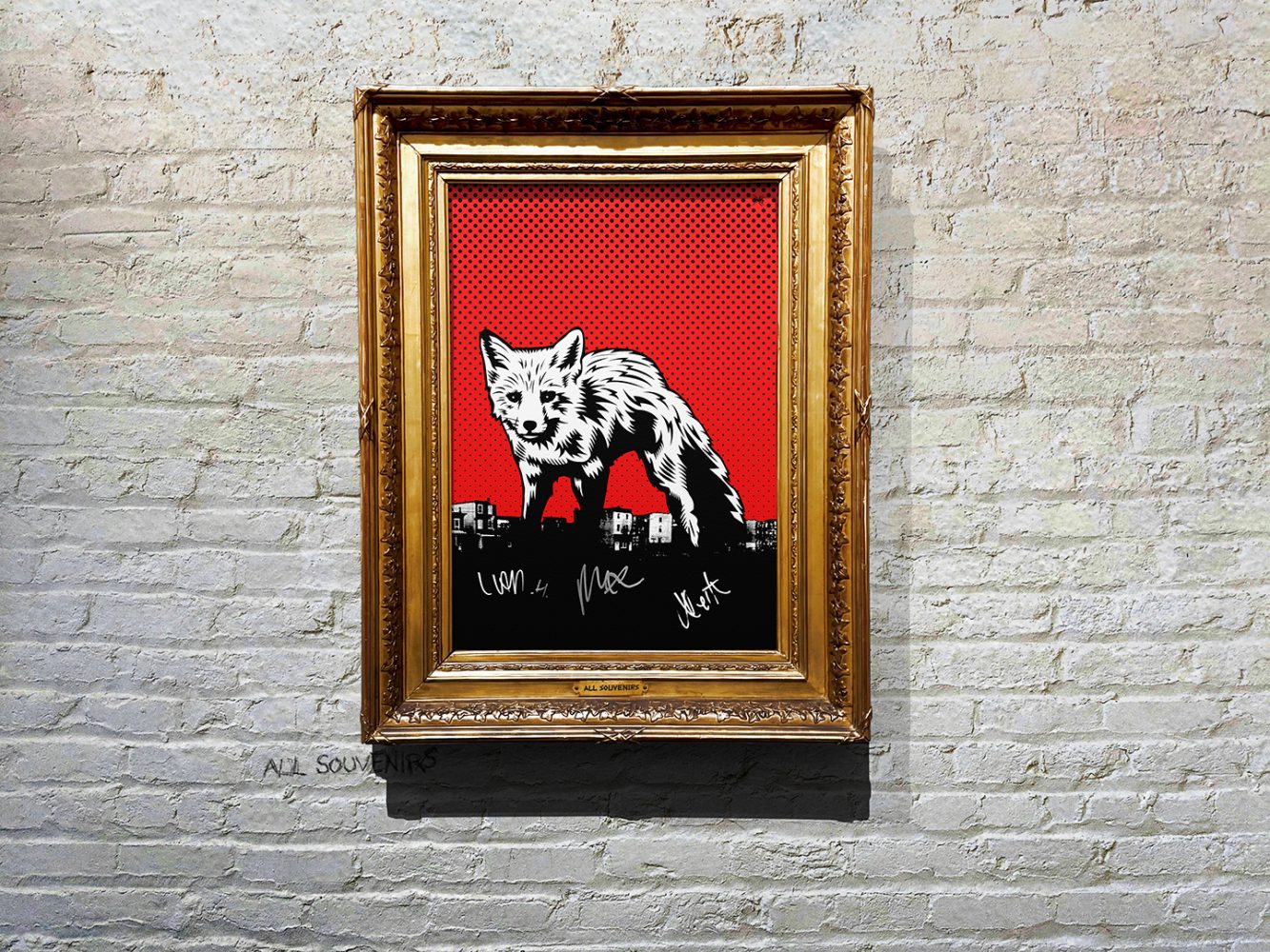
In January 2016, The Prodigy’s official store released a poster with an updated version of the artwork in McFarlane’s more signature palette of black, white, and red. As with other limited-edition items, the art print — signed by the band — sold out in a matter of hours.
It’s fair to say that the creation of the ‘The Day Is My Enemy’ cover is the most thoroughly documented in The Prodigy’s history (quite surprising that Liam even allowed it, huh?). No other release by the band has been discussed in such detail and with such openness — especially by the designer himself, and so soon after the release. In the following years, McFarlane gave several in-depth interviews and shared hundreds of concept drafts to show fans — and fellow designers — just how difficult the hunt for a killer idea can be. Some of the rejected concepts were even sold as NFTs.
Fortunately, a few of those rejected drafts found their place later. Four years after the first versions appeared, one early design was revived for the band’s next visual era: the ‘Champions of London’ print, used on Leo Crabtree’s drumkit during the ‘No Tourists’ tour, and sold on t-shirts at shows and through the official shop. That design had originally been part of the 166 covers proposed for ‘The Day Is My Enemy’. It was clearly inspired by legendary New York punk-rockers The Ramones, whose classic logo — designed by Arturo Vega — was reimagined by McFarlane with a monkey and the British Parliament emblem.
Funny enough, just ten days after we dropped the illustration above on our Instagram — recreated from scratch to mark the launch of the new T-shirt series — Liam reposted it on The Prodigy’s page as his own thing.
Nick McFarlane via Instagram: ‘The illustration is a collision between a 1 penny coin, an eye patched gorilla and the old classic Ramones logo. It’s also 1 of my 165 rejected design options from their previous album. Nice to see it get some daylight.’
The experience of working with Liam also helped inspire McFarlane’s book ‘Hunting the Killer Idea’, in which he reflects on the nature of inspiration and where today’s creative heroes find it. Naturally, the book includes a short interview with Liam Howlett himself. Despite the long and difficult road to the final artwork, McFarlane was neither frustrated nor burnt out by the process — on the contrary, he remained a fan of the band’s music.
Nick McFarlane for The New Zealand Herald: ‘I’ve been listening repeatedly since it dropped. It’s a big heavy beast, quite abrasive, quite punk … I’ve always been a fan.’
Headmasters: SPLIT
Additional thanks to: Nick McFarlane, Ian Wade
Donate

 Tether (USDT)
Donate Tether(USDT) to this address


YOOMONEY (RUS): 7928З82272З