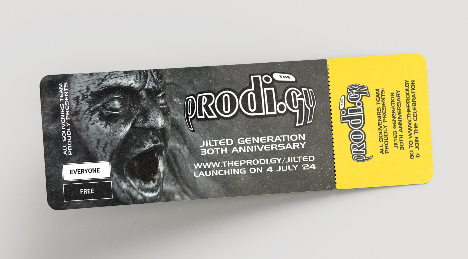
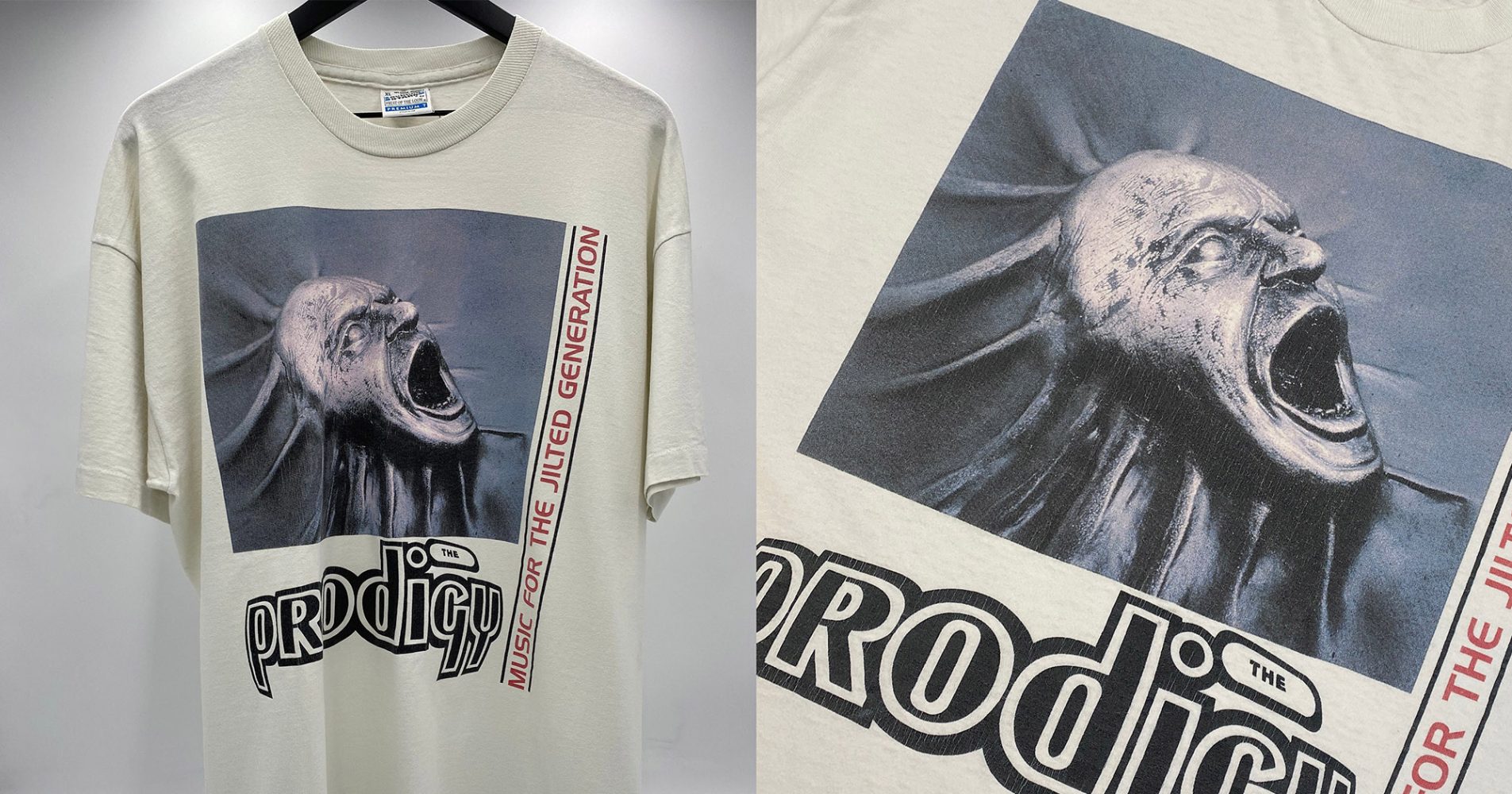
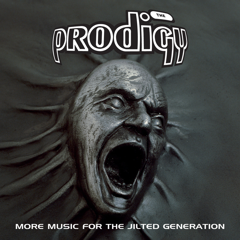
Jilted Generation: 30th Anniversary
Released on 4 July 1994, Music For The Jilted Generation undoubtedly changed the world of electronic music and had a huge impact on the pop culture of the Nineties. To celebrate the 30th anniversary of The Prodigy’s second LP, All Souvenirs tells the full story of the album’s legendary artwork, which has become as iconic as the music it represented.
We spoke to the owner of the sculpture on the cover and caught up with the photographer who took the final shot. We also uncovered rare details about the rejected designs, got some exclusive footage from one of the designers and shed some light on the artist who created the original sculpture…
A random purchase
One day, Samantha Fisher and her then boyfriend Danny were strolling through London’s Camden Market in the very early 1990s. It is a popular destination for counterculturists of all stripes: since the mid-1970s, tourists, punks, teenagers and old ladies have flocked to Camden’s long rows of stalls all year round to buy books, clothes, jewellery, souvenirs, toys and more. As one of the main attractions in London, it is visited by a quarter of a million people every week.
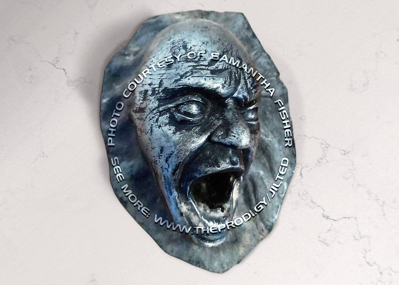
Photograph by James Fry | www.jamesfryimage.com
Published in Martin James’ ‘Prodigy’ (2002, Sanctuary Publishing)
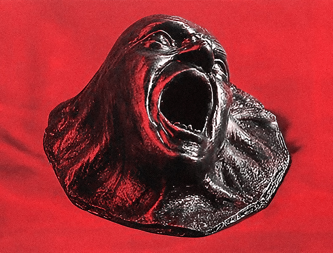
Walking past one of the counters, Samantha caught a glimpse of an unusual metal sculptures: ‘I vaguely remember there were different types of sculptures of a similar nature, but all unique’, she says. But she was hooked by a single one: a screaming face, contorted into a frightening grimace, as if gasping for air, trying to break through a thick layer of skin or some other material. The image evoked a host of associations: from the alien experiment scene from Fire in the Sky movie to the carbonite-frozen Han Solo from ‘Star Wars’ or Munch’s ‘Scream’. Someone will think of an episode from Liam Howlett’s favourite horror movie, ‘Poltergeist III’, where a terrified Donna Gardner emerges from the corpse of Tangina Barrons. Others will surely have even more similar passages in mind.
Without a moment’s hesitation, Samantha bought the small (approximately 7×8 inch) aluminium figure and hung it in her own living room back home in Leigh-on-Sea, Essex. This was around 1990: just a few years later, this sculpture would appear on the cover of one of the most iconic albums of the decade.
Samantha Fisher for All Souvenirs: I became very good friends with The Prodigy’s manager Mike Champion and I also became friends with the band. It was around the time that Liam had finished writing the ‘Jilted’ album and was stuck for the front cover. Mike came round to my flat and saw the sculpture and said it would be great for the album. He took it to show Liam and the next thing I knew it was going to be used for the front cover and was sent to XL Recordings (the band’s record label at the time) to be photographed.

The year 1993-1994 was in many ways a turning point for The Prodigy. Rave seemed to have exhausted itself, not without the encouragement of the authorities, and was rapidly turning from a true underground culture into a purely commercial scene. Meanwhile, Liam was starting to discover guitar bands, writing a lot of new music and wanting to do something more rebellious – everything seemed to call for a change. Not only were the tunes changing, but so was the band’s image: the guys were bored with the cheerful, out-of-date concert outfits, and they wanted to change them for something more appropriate. The same went for the merch and cover artwork: Liam wanted the design of his releases to be deeper and real. He was done with the bright meaningless covers that the band had been presenting since its inception.

A major factor in The Prodigy’s growth was the infamous ‘anti-rave’ Criminal Justice Bill, which had its roots in the early 1990s and was finally passed in 1994: the government quickly realised that the new craze among young people for rave parties was becoming too widespread and uncontrollable, and began to introduce rapid prohibition measures.

The band had already spoken out a few months earlier – in October 1993 they had issued a long statement on the inner sleeve of the One Love single, ending with ‘Bollocks to the authorities, you can’t stop us, we’re gonna keep the dance scene strong even if the world isn’t’ – but with each passing month the tensions in British society continued to rise. It all had a straight-forward impact on the band.
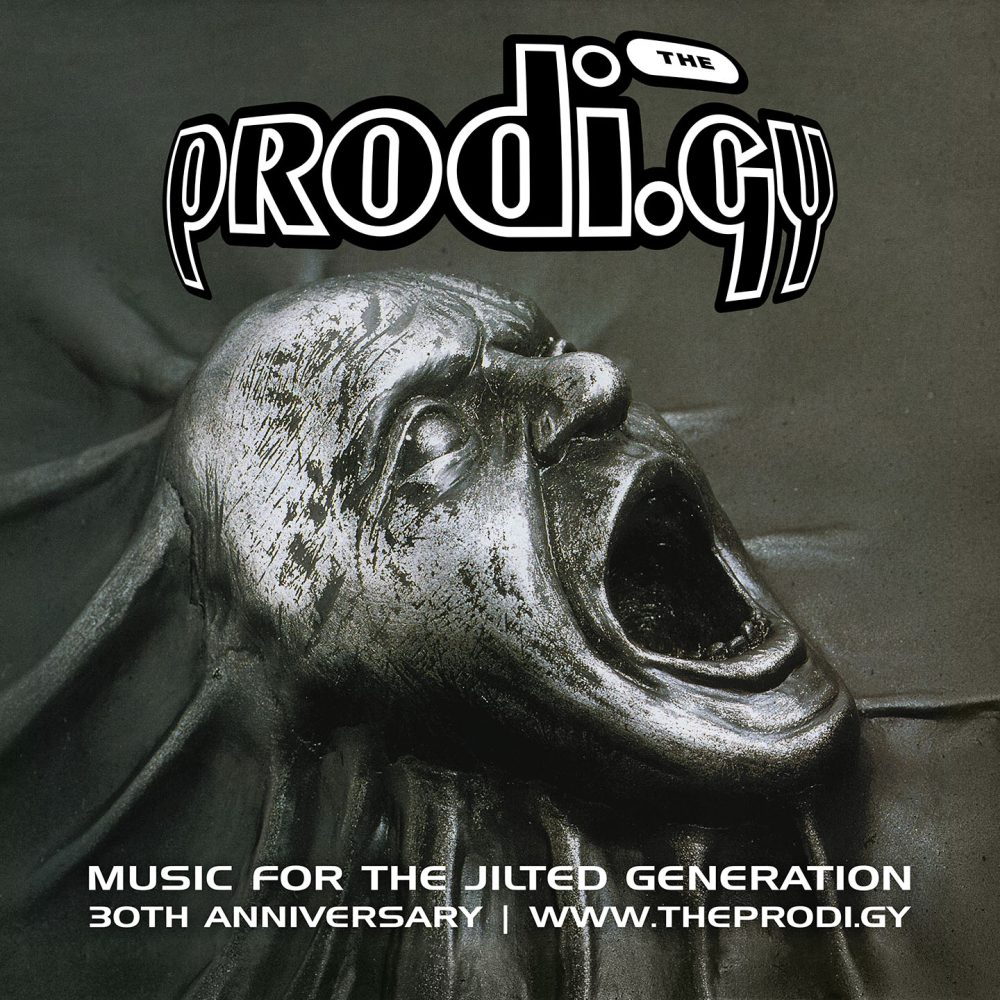
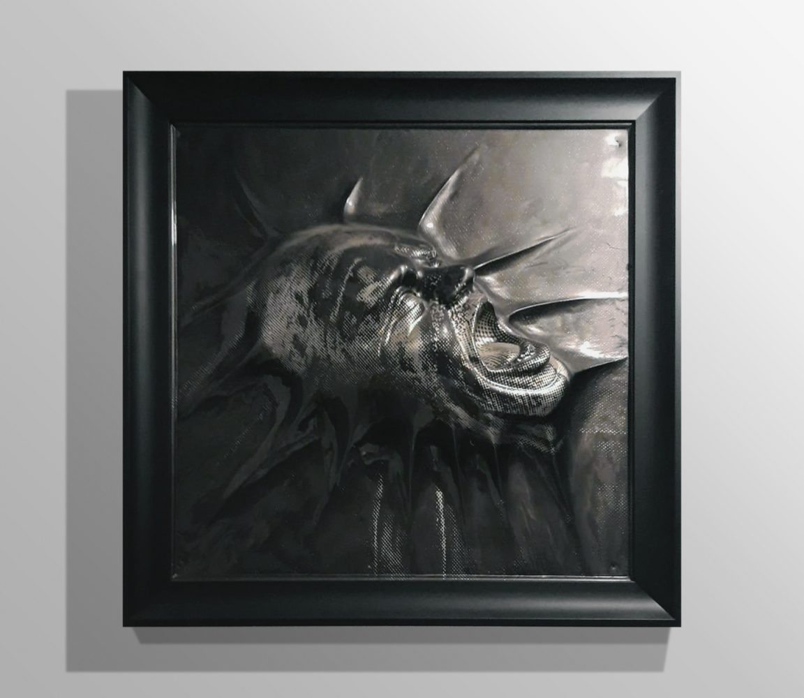
The front cover of ‘Music For The Jilted Generation’ was shot by Stuart Haygarth, who worked with XL Recordings at the time, designing releases for the label, and the photo shoot for The Prodigy was one of the ongoing commissions for him. A few years ago, All Souvenirs had the honour of talking to Stuart and getting some important details from him.
Stuart Haygarth for All Souvenirs: I was asked by the record company to create the cover using a plaster cast screaming head that they got from Liam Howlett. They wanted the head to look as if it was pushing through a skin or membrane. Using modelling clay and other materials I built around the head to create these stretched sinus. The model was then spray painted to give a metallic finish. Finally I photographed the model in my studio and delivered the film to the record company – the rest is history…
Speaking to Dazed, Stuart talked about how his role was more of a technical one, working with a ready-made concept and material that only needed a little tweaking: he simply ‘went away with some props and tried to model and photograph the ideas’ the band had given him.
Stuart Haygarth for Dazed: They didn’t pass on any specific notesor guidelines, and it was an unusually straightforward experience. I just handed over the film and everyone seemed happy. And while it’s a great album and I’m very proud of it, the artwork kind of makes me cringe because I never liked it. It’s not an idea I’d come up with or can relate to – it’s all a bit heavy metal.
In a special post by the covet_the_cover on Instagram, Alison Fielding, art director at Beggars Group (the home of XL Recordings), shared her memories of the project.
Alison Fielding for covet_the_cover: We had a model maker who happened also to be a great photographer (Stuart Haygarth) create a mould to make it look more aggressive, like it was emerging from something. It worked! Photoshop skills were very limited in those days.
Stuart was paid £400 for the work (no royalties either!) and doesn’t even mention it in his portfolio. After working as a photographer in the mid-nineties, Haygarth later took up illustration, and after a further 10 years began working in mixed media, which he still does today.
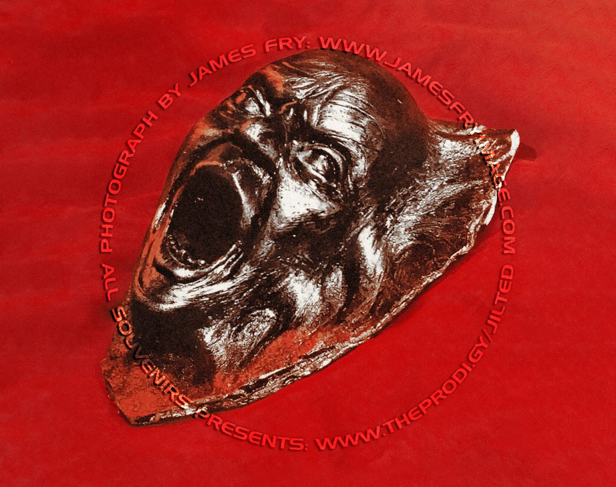
Curiously, before Stuart’s photo shoot, the first images for the cover were done in a warmer and more colourful way. After Mike Champion handed the sculpture over to XL Recordings, it was first captured by photographer James Fry, who has worked with Propellerheads, Public Enemy, Lee Scratch Perry, Oasis and dozens of other well-known artists and DJs over the past 30 years. In 2021, Jim had a long chat with the All Souvenirs team and revealed an incredible amount of interesting details about his work with the band.
James Fry for All Souvenirs: One day I got a call from XL Recordings: “We’ve got this metal head, can you take some portraits of it?” — I photographed it from loads of different angles, sent it to the record company and they never used it. I still have this brilliant set of photos of the head, but I have no idea where it went after that.
The metal sculpture on a red background looked much more catchy and bright, as opposed to the cold, gloomy and distant image that resulted in the final cover. You can see that Jim photographed the original sculpture that Samantha bought, not the plaster one that Stewart worked with. Some images from the series can be found in Martin James‘ books, and for All Souvenirs Jim Fry has shared three more images from his archive that have never before been seen online.
These photos will be posted
on our Instagram on 4 July 2024
Join in: instagram.com/theprodi.gy
In fact, by the end of the preparations for the album, Liam Howlett could not make up his mind about the final message he wanted to convey: the doubts extended not only to the design of the record, but even to its title. Martin James wrote in his We Eat Rhythm that the record could have been called Music For The Cool Youth Juvenilia or Music For Joy Riders – although Liam argued that both of these titles were made up by the music press.
The album artwork was discussed within the band as well as with photographers and label staff. Before the iconic sculpture caught Mike Champion’s eye, the guys had several ideas: for example, the original album cover was going to be a police hat on fire — at the same time, in an interview for Mark Dynamix in late spring 1994, Liam said that such an image would be too controversial and the band didn’t want to get too heavy.
Speaking to All Souvenirs, Jim Fry shared another idea that was considered as one of the working options – equally radical, but leaving more room for interpretation.
James Fry for All Souvenirs: One of the ideas around this time was to emboss a house brick with the words ‘Music For The Jilted Generation’ on it. I’m not sure if the idea came from the designer or the band itself. The brick was going to be smashing through a window, and there’s been a lot of discussion about how we’re going make this happen. It’s quite funny because nowadays this would be so easy to do, but these were kind of pre-photoshop ideas, and they were really really strong in my opinion. I think the brick going through a window would have made a great record cover and an even greater t-shirt.

Photograph by James Fry | www.jamesfryimage.com
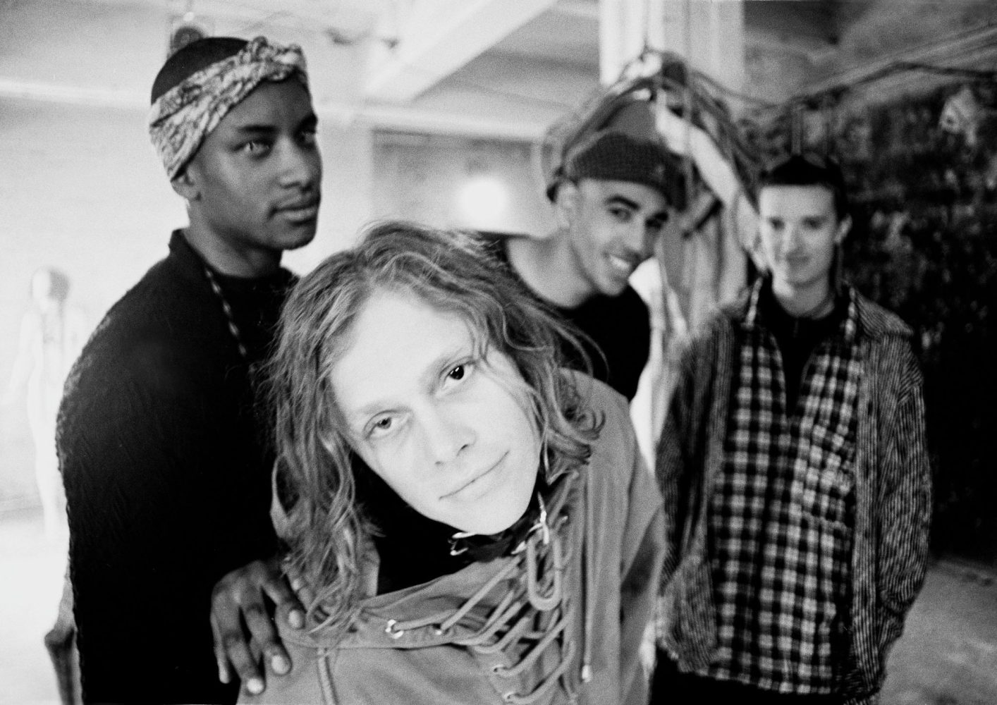
It’s also interesting to note that Jim Fry’s headshots, which didn’t make the final cut, and the discussion of other ideas for the cover, were not his only contribution to the album’s artwork. The rear sleeve of the record features two shots of the four members of the band: the sombre sepia portraits of Maxim, Liam, Keith and Leeroy staring at the camera — these pictures were also taken by Jim Fry. They were captured during the filming of the No Good music video a few months before the album’s release.

‘Music For The Jilted Generation’ back cover
Photograph by James Fry | www.jamesfryimage.com
James Fry for All Souvenirs: Eventually, I would take some pictures of the band later, it was at the No Good (Start The Dance) video shoot. Some of those photos would get used on the back cover of the Jilted Generation sleeve: if you look at it, you’ll see Keith’s Flint head has been replaced. It’s quite basic, in the true ‘cut up’ spirit of Punk Rock. Nowadays we have Photoshop and we would create this really smooth finish in minutes, but back then it was very raw.
Keef’s head was cut out of this shot for the ‘Jilted’ back cover
Photograph by James Fry | www.jamesfryimage.com
James Fry for All Souvenirs: Back in 1996 Liam Howlett said something to me that really touched me, he said: ‘Thank you for making us look like The Clash’. And it started to make sense to me, this is a punk band, and I grew up with punk, that was my music, but this was with synths and drum machines, but pure punk rock. I never got to work with The Sex Pistols or The Clash but it doesn’t matter, because I got to photograph The Prodigy.
However, the band eventually settled on the final design of the album and the LP went to press. Remarkably, at the time of the album’s release, neither the band nor their management had any idea who the original artist of the sculpture was. Howlett thanked Samantha and Danny in the record’s sleeve (‘you know why’) and the album was an unexpectedly phenomenal success, topping the charts and quickly achieving platinum status with over 600,000 copies sold. The band have begun to reap the rewards of their success.
Photograph by Steve Baxter
Square plastic moulds with a 3D album cover were created to support the UK release: some claim that this was an unofficial promo, but it was nevertheless displayed in HMV, Andy’s Records (Chelmsford) and other music shops to promote the LP, and was even mentioned on the official promo posters as ‘3D window displays’. These moulds would have been in place for the album release day, 4 July 1994. Although they were never intended for sale and were only used for promotional purposes, they can still be found on eBay from time to time.
Someone has also claimed that copies of the original sculpture bought by Samantha Fisher were being sold at concerts after the album was released, but we haven’t found 100% confirmation of this. However, several photos of the sculpture have been seen in fan communities that are quite similar to Samantha’s original — the shots have been taken by different owners.
This way or another, there are 3 kinds of sculptures that can be called ‘original’:
- Metal (aluminium) sculpture originally purchased in Camden (number of copies unknown)
- Plaster cast photographed for the cover (it was made from a metal sculpture and exists in a single copy)
- Plaster copies, probably sold at concerts (number of copies also unknown)
For the record, Mark Reynolds, who had already worked on visuals for The Prodigy at the time, was once asked to produce a television commercial for ‘Music for the Jilted Generation’. The spot also featured the sculpture from the album cover! However, the campaign never saw the light of day — Liam Howlett rejected the idea of promoting the release through TV ads.
Mark Reynolds for All Souvenirs: I do remember making a TV commercial for Jilted Generation, which the marketing department at the time wanted. I wasn’t impressed with it, neither was Liam, so it went in the trash. Cannot for the life of me remember much about this job except it was pretty rubbish, it’s all a bit of a blur to be honest.
In general, the album artwork proved to be deep and strong, and everyone could read into it whatever meaning they wanted. Some read the message of the cover as the band pushing their boundaries: on their second album, The Prodigy were entering a completely new territory, radically different from where they had been before. Others interpreted it to be a visual response to the criminalisation of raves. And although Liam Howlett would later deny ‘this fight the party bill’ message countless times, it’s hard not to see ‘Music For The Jilted Generation’ as a reaction to the law.
In the above-mentioned interview for Mark Dynamix in spring 1994, Howlett speaks openly about his dislike of the situation with the bill in Britain, criticises the government and the police and reveals the political context of the album in detail. Consider Their Law: while working on this tune, Liam even wanted to include an extended version of the lyrics, not just the chorus, and that’s where he and Pop Will Eat Itself planned to go full steam ahead. The inside sleeve of the album also spoke volumes.
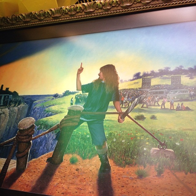
Fight For Your Right: Inside Sleeve
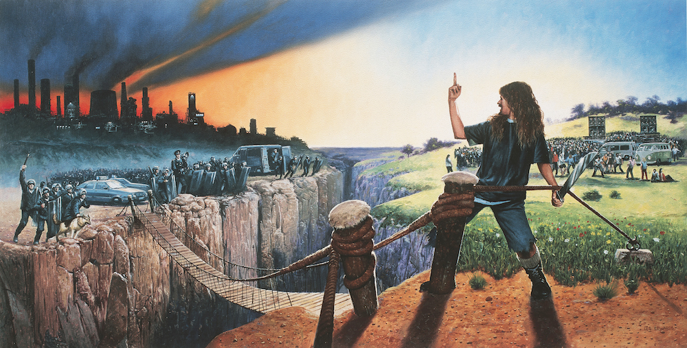
Painted by Les Edwards | lesedwards.com
The artist behind this expressive work is Les Edwards: as he himself writes on his website, the image was ‘painted for the album by The Prodigy and closely art-directed by the band to illustrate their philosophy’. Born in 1949, the British illustrator is known for his work in the horror, science fiction and fantasy genres. Throughout his career he has created numerous illustrations for books, posters, magazines, games, music releases and films: Edwards has illustrated books by Lovecraft and Stephen King, designed albums by Metallica and Uriah Heep, worked with Monty Python and a host of other big names.
At some point, the band contacted Les’ agent and asked him to do some work for the band’s new album. Edwards himself in an interview for Dazed said with a smile that ‘the only problem was that they kept describing what they wanted in street slang, so sometimes I had no idea what they were saying’.
During the discussion Les had not heard any new music from the forthcoming record. According to Beggars’ Alison Fielding, the original idea was to use this painting as the main cover, but everyone realised that it only worked well as a landscape and that squaring it up would not be the best concept. Basically, this painting could be described as another rejected album cover!
In the same feature for Dazed, the artist commented afterwards that the juxtaposition of the brightly coloured illustration on the inside spread and the sombre, dark cover of the record was a bit odd, but in the end it all worked well.
Les Edwards for Dazed: I’m something of an old hippy, but it seems to me to be the same message you’d heard in the 1960s, people criticising governments for being tyrannical. I don’t remember the 1990s as being a particularly repressive time, but if you were Liam and Keith’s age, perhaps you felt differently. Rave culture was going on, and people just disapproved. There was a bit of concern about the drug culture, but in a lot of instances, the police were so heavy handed. Things haven’t changed there.
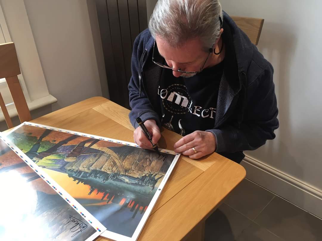
Edwards’ original artwork is apparently still in the possession of Liam Howlett. In Martin Roach‘s book ‘The Fat Of The Land’, one of the pictures shows Liam with a framed ‘Jilted’ sleeve behind him – the photo was presumably taken in 1996-1997. The painting was next spotted on Howlett’s Instagram in 2014: ‘The original painting I just found! It’s a good day!’
By the way, posters with Les’ artwork were officially printed not only in the 1990s but also in the 2010s! To be precise, in July 2016 the reprint was released in a limited edition (300) in collaboration with Coriander Studios – the item was available in the band’s official shop in 2 different versions (small white framed and large gold framed). The band also posted a video of the poster being printed and signed by all 3 members, which generated dozens of flashbacks from fans sharing their stories about the image on The Prodigy’s socials and communities. The image for the 2016 reprint was possibly re-shot from the original painting by Rahul Singh, a long-time friend and photographer of the band who works with the boys for decades.
Font & Logo
On the inner sleeve of the album, after the traditional credits and respects, there is a separate line with the message ‘How can the government stop young people having a good time. Fight this bollocks’ – a very clear reaction to the bill.

The font used for the inner booklet and album title is called Handel Gothic, and it clearly captures the spirit of the times – you may recall that Pop Will Eat Itself used it on their own releases and adverts around the same time (they actually still do).
The original ‘Experience’ logo by The Unknown Partnership‘s Steve Gribbin (aka Jaffa) was slightly altered on the band’s second album: Beggars’ Alison Fielding distorted it into a bulgy shape. Some will recall that there were actually two versions of this logo: the first was used on ‘One Love’ and ‘No Good’, where the shape was more radically distorted, and the final ovular version was used on the rest of the ‘Jilted’ era releases.
XL Recordings reissued the album several times, but the most interesting release came in 2008: the artwork for the reissue, entitled More Music For The Jilted Generation, featured a never-before-seen shot from the same final photo shoot by Stuart Haygarth, while the fans were treated to some unreleased tunes on the second bonus CD.
The artist behind the sculpture
In mid-1994, 24-year-old British artist Jonathan Tucker-Bull, then living in the United States, returned to England and could hardly believe his eyes: a music album with a cover featuring a sculpture of his work was topping the charts, selling in every store and being discussed by leading music journalists. Imagine the surprise of the artist, who had not authorised the use of his work. The original was created in 1990 and was called The 20th Century Scream – a copy of which was bought by Samantha Fisher on London’s Camden Market. Tucker-Bull lived in Camden at the time, so it is quite possible that Samantha bought the statue from the man himself!
Jonathan Tucker-Bull for Select (November 1994): I’d been living in New York and returned to find it all over magazines and record shops. I didn’t even know who The Prodigy were.
The band and their label were similarly unaware of Tucker-Bull. Eventually the artist got in touch with The Prodigy’s management and, after being suitably reimbursed, Jonathan has made a limited number of copies for the fans. It differed from the original in that it had a flat rectangular shape around the head (instead of the angular shape of the original). Each sculpture bore the artist’s signature: © J.T.B. 1994
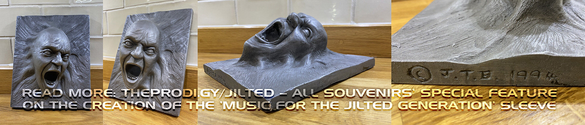
The new sculpture didn’t cost much: in November 1994 it cost £39.99 – at the exchange rate of 2024 that would be just over £80. 30 years ago, fans could get a unique piece of history for next to nothing! Jonathan’s 1994 copies have only appeared a handful of times on eBay and in fan communities on Facebook, and although it seems to be slightly more common than the 1990 original, it’s still a real rarity.

Jonathan Tucker-Bull’s name was added to the album cover T-shirts after a while, and that was probably the end of the interaction between the artist and the band. Strangely enough, John himself, born in May 1970, seems to have left no digital trace over the last two decades, and it seems impossible to contact him: all we know is that in 1990 he worked on special effects for the films Hardware, Living Doll and Horrorshow, and during the next decade he only gave a couple of short interviews for the Independent and the BBC. According to the information available so far, it is also difficult to determine whether the artist is still alive or not.
Bonus fact: among old-school fans, the head on the cover is called Ed – it’s not clear whether this name was made up by the fans of The Prodigy or by the band members and their friends. It’s most likely a dedication to Edvard Munch, whose ‘Scream’ is the first image many people think of when they first see Jonathan’s work.
Liam Howlett for Clash Music: The cover is alright, the sleeve is alright. People don’t give a fuck about covers anymore, but in those days… To be honest, ‘…Jilted’ isn’t one of my favourite sleeves, but people seem to like it. Everything you see is the effort of the band to get things right
The Prodigy’s second album, which became an anthem for generations, could hardly have attracted so much attention without its artwork: in this case, the visuals are probably as important as the music itself – and with the design of this record, everything fits perfectly. The cover perfectly reflects the spirit of the time in which it was created.
Headmaster: SPLIT
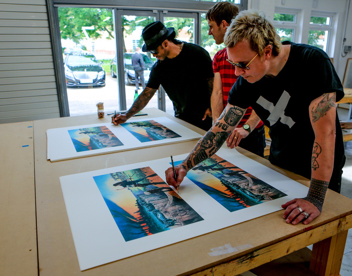
Additional thanks to: Samantha Fisher, James Fry, Stuart Haygarth, Mark Reynolds, Jeremy Downes (header source photo)
Donate

 Tether (USDT)
Donate Tether(USDT) to this address


YOOMONEY (RUS): 7928З82272З

Rockin time to read it!!