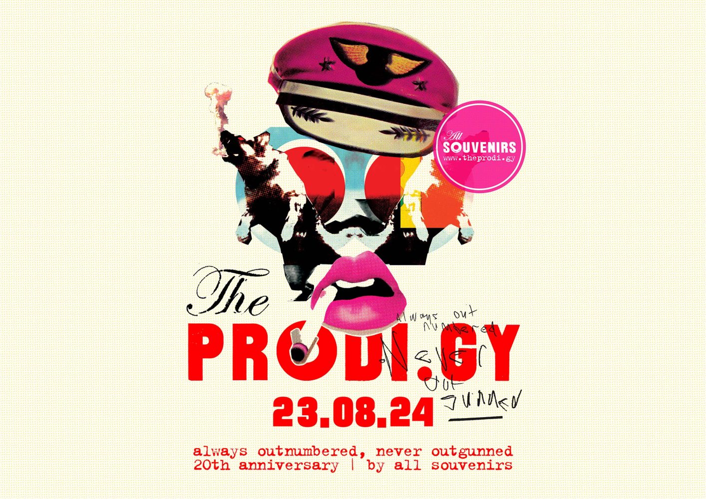
#AONO20: ‘Always Outnumbered, Never Outgunned’ Album Artwork & Design
The Prodigy’s Always Outnumbered, Never Outgunned was released in the UK on 23 August 2004 and in Japan two weeks earlier on 11 August. In 2024 this record will be 20 years old. There’s a lot to say about the production of the album, and we’ll be sure to cover it in future articles – but today we’re dedicating our little anniversary feature to the album artwork. The All Souvenirs team had a chat with the designers and got a lot of exclusive details from them!
Designed by Intro | intro-uk.com
Intro UK is an independent creative agency with a longstanding reputation for producing ground-breaking work across all media. Established in 1988, Intro pioneered cross-media working: they were one of the first studios to do everything under one roof. They worked with Depeche Mode, Primal Scream, Placebo, Oasis, Can, and dozens of other great artists. Back in 2004, they made an album design for The Prodigy’s ‘Always Outnumbered Never Outgunned’, and also created a TV campaign to promote the album. Julian House & Anna Bergfors were responsible for art direction, and Nikki Hildesley also made a huge contribution as a producer and a manager. But first things first…
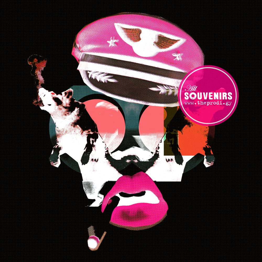
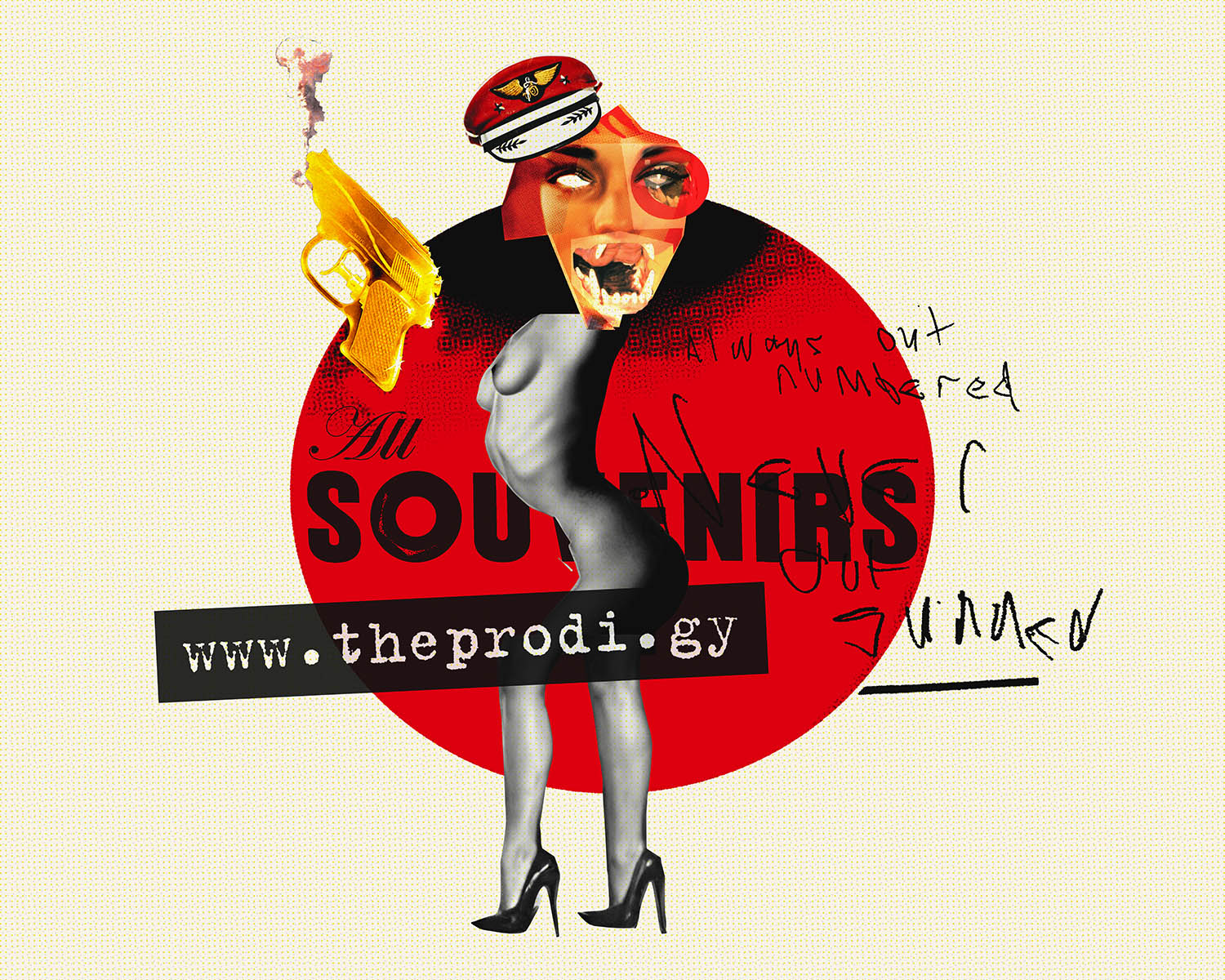
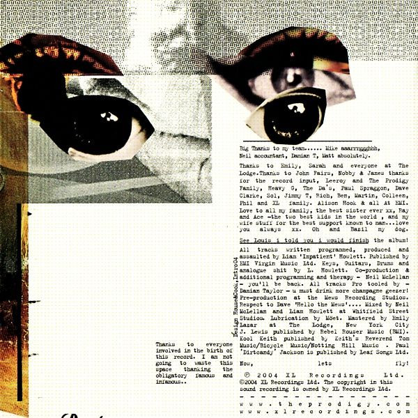
Loads of people worked on the sleeve before Intro, like Jimmy Turrell, Mark Gray and other people, but their stuff was rejected at the last moment literally. In general, the aesthetics of militarism and references to the themes of the Second World War, which are actively used in the album, could not help but be reflected in the design of the record. Liam Howlett listed a number of inspirations for Intro, both audio and visual such as war, disco, plague and propaganda, then Intro responded with about 20 sleeves. The team was inspired by American and British war propaganda posters and political groups CND, as well as the anti-fur lobby and Czech film posters. During the work, Intro used hand-drawn type, web downloads, de-ressing, cut-outs, damaging materials, photoshop, quark, photocopying and digital cameras.
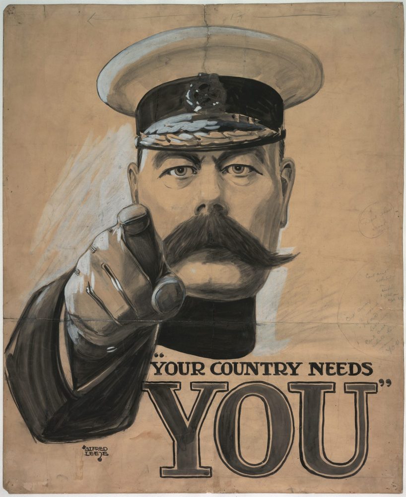
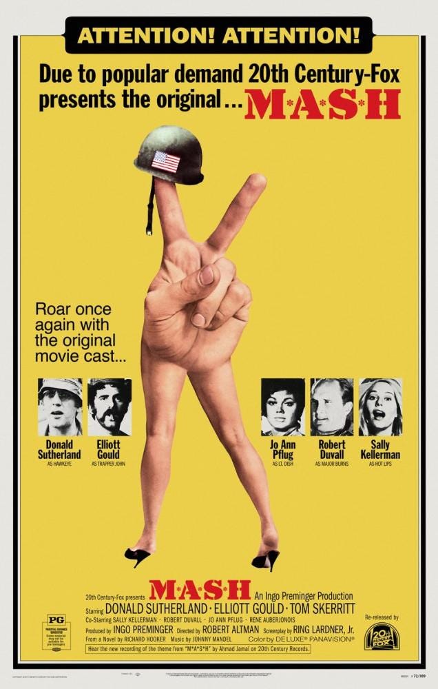
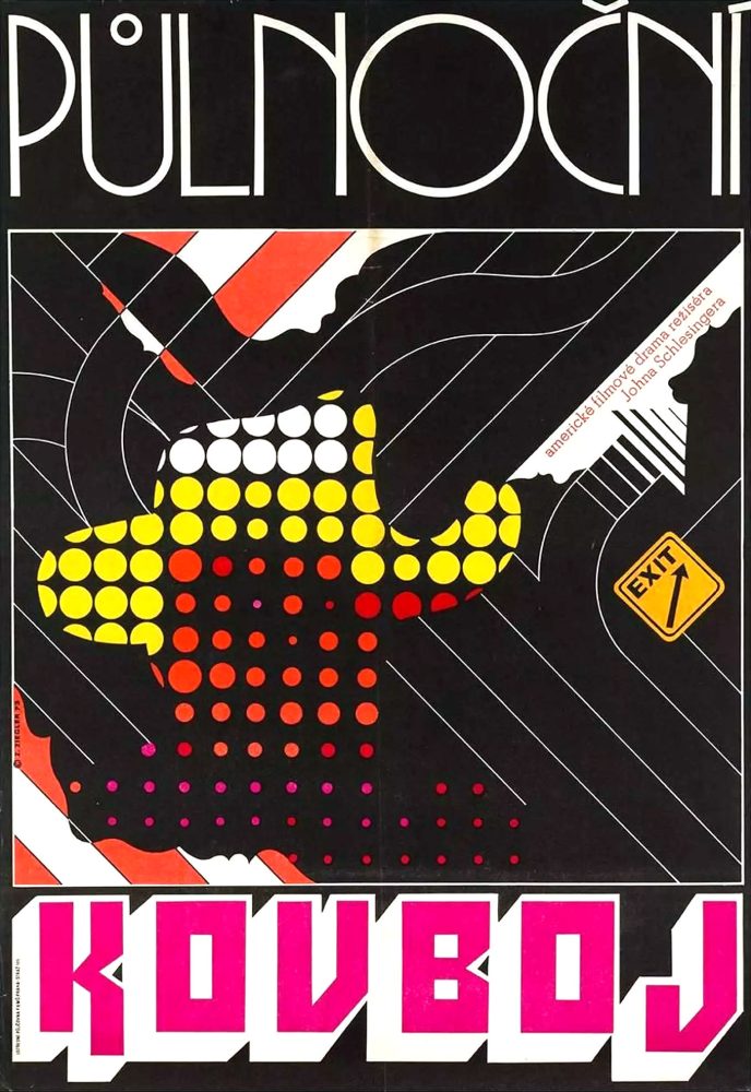
Anna Bergfors for All Souvenirs: The art was very much a pop art inspired cut-up of ‘Your country needs you’ with all the references above and also the ‘M.A.S.H’ film poster and the Czech poster for ‘Midnight Cowboy’. And a lot of 60’s cigarette-toting movie stars also made the cut.
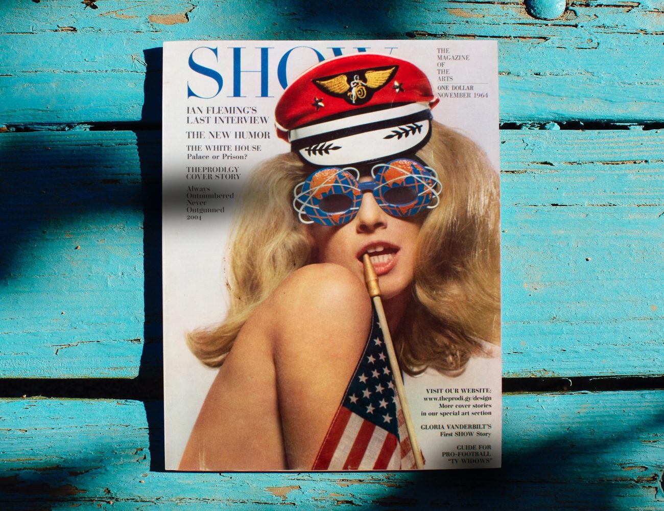
The hat was cut from the SHOW magazine issued in November 1964. Sixties actress, model and Andy Warhol superstar Jane Holzer was shot by David Bailey, an English fashion and portrait photographer. Movies she appeared in included Andy Warhol’s Soap Opera (1964), Couch (1964), and Camp (1965), and the independently produced Ciao! Manhattan (1972).
Anna Bergfors for All Souvenirs: We actually shot my lips for the art and I smoked the cig, even though I don’t smoke — method design.
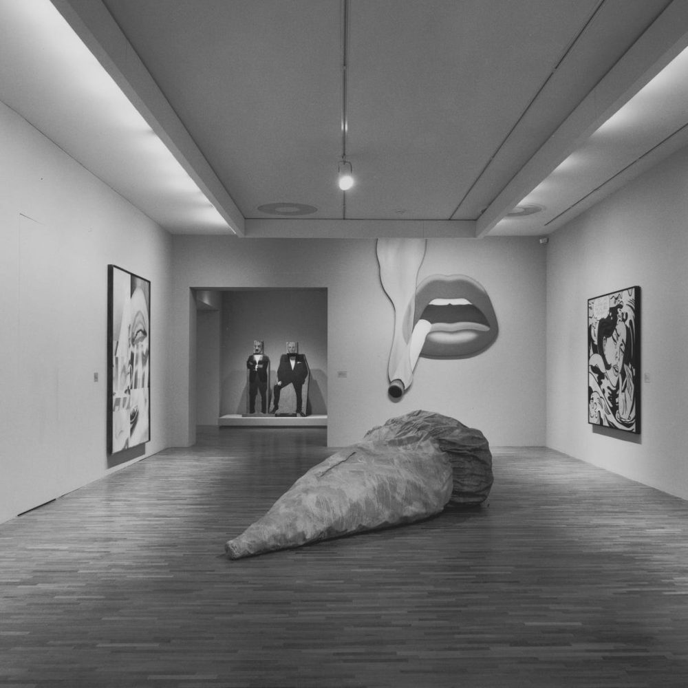
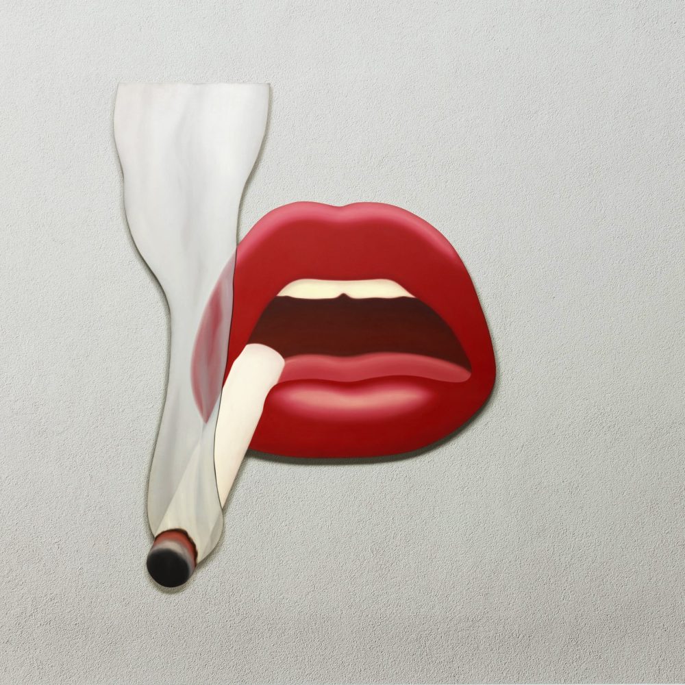
The lips on the cover were probably inspired by Tom Wesselmann, an American pop art creator associated with the Pop Art movement who worked in painting, collage and sculpture. In his Smokers series, developed from the late 60s as an outgrowth of the Nudes and continued through to the early 70s, Wesselmann shifts his focus on to one specific part of the woman’s body, thus emphasizing the element of fetishism present in his oeuvre since the earlier works.
The Prodigy logo was based on one of World War II’s most famous posters. Jean Carlu‘s America’s Answer! Production was created in the pre-Pearl Harbor summer of 1941. Arguably America’s most substantive role in World War II was supplying the sheer material preponderance that eventually overwhelmed the much more aggressive and better-trained German and Japanese forces. This is one of the first posters that mobilized Americans and made them aware of the one way they could help to end the bloodshed. Carlu worked in the United States from 1939 to 1952. When he first submitted this design, in the pre-Pearl Harbor summer of 1941, it was a mobilization poster; it became a war poster when it was issued in 1942.
Originally designed by Intro | intro-uk.com
In 2004 the band revamped their official website in the style of the album artwork – this work was done by Eugene Riecansky and his company Rockstar together with Intro UK. There were a couple of easter eggs on the site, including an interview with the Intro team and one of the rejected alternative artworks – it was displayed in one of the sub-sections dedicated to the designers. Back then, the internet was dozens of times slower than it is now and the cover was posted in super low quality for quicker download – the All Souvenirs team have restored it especially for this anniversary article.
Anna Bergfors for All Souvenirs: I think it’s great to see working versions, I remember lots of them. I keep most everything, but it will require a bit of digging to find some!
Nikki Hildesley for All Souvenirs: The whole process took weeks, days of late hours. I’d leave Anna at the studio late and return to watch the recently created magic the next morning. She worked so hard editing that project. Julian House researched and created images and ideas with Anna. It was hard to know when they’d finish! Rendering also was a large part of the process, took ages and was frustrating at times! Finally, after some input from Liam Howlett, we got to a point where everyone was happy.
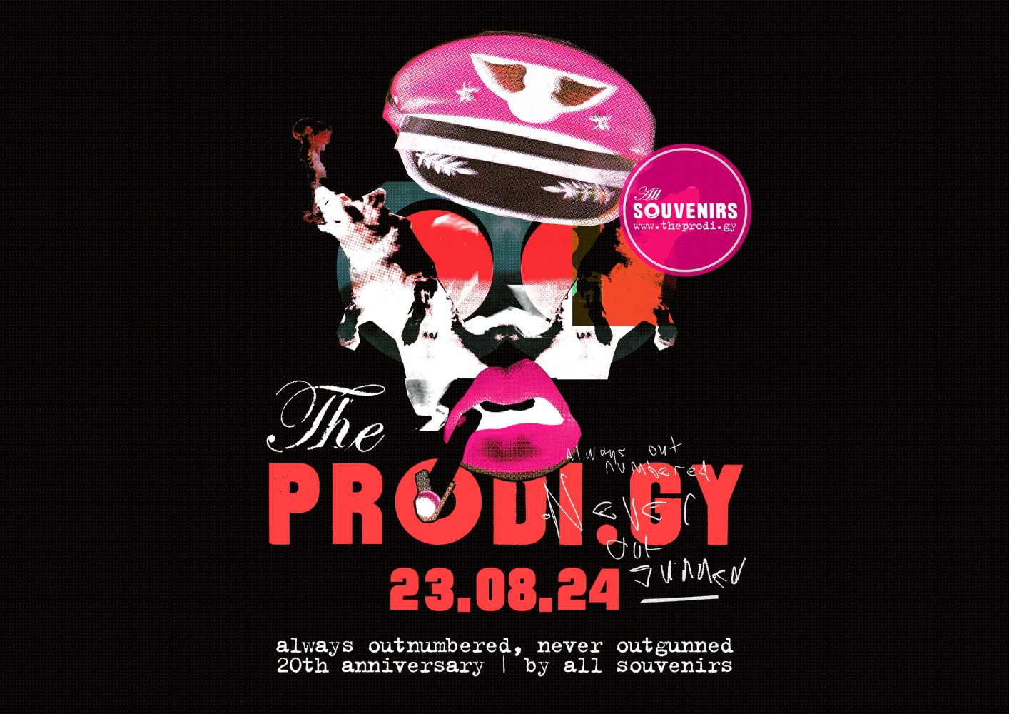
The final one was actually presented in the pitch, only small tweaks were made. Lip and hat colours were changed. By the way, many fans may remember the dark version of the album cover. The album with the black artwork was only released in a small limited edition, and many people still wonder whether this was a printing error or a deliberate design choice. As we can see, it is almost impossible to get such colours from the original by accident, which means that this design was intentionally released in this colour scheme!
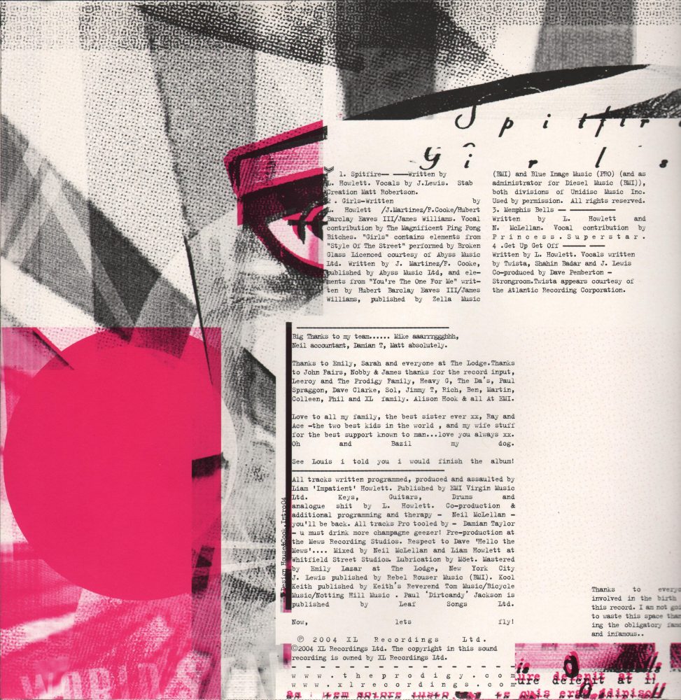
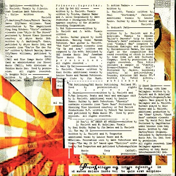
It should also be noted that the design of the CD and vinyl editions of ‘Always Outnumbered, Never Outgunned’ are very different: those who have only had the compact disc in their hands are often surprised by the richness of the vinyl design. The edition on three 12″ gave the designers much more space in the sleeve, which they used to the full. Fun fact: on the inner sleeve, besides the actual credits, there is also a Lorem Ipsum-type dummy text (e.g. the words ‘Consequat aliquam eum iriure delenit’ or ‘auten dolore iusto vel te quis crat adipisc’), which has no meaning in any language.
Nikki Hildesley for All Souvenirs: The process was key. It was great to have a decent schedule to work with. The band was quite hands-off through most of it. They trusted Anna and Julian to create something completely unique and it was. Always nice to be a gifted time and trust from a band. I was always surprised that it didn’t completely take off! I loved working with Anna and Julian and being part of it. It was a great team, a brilliant experience.
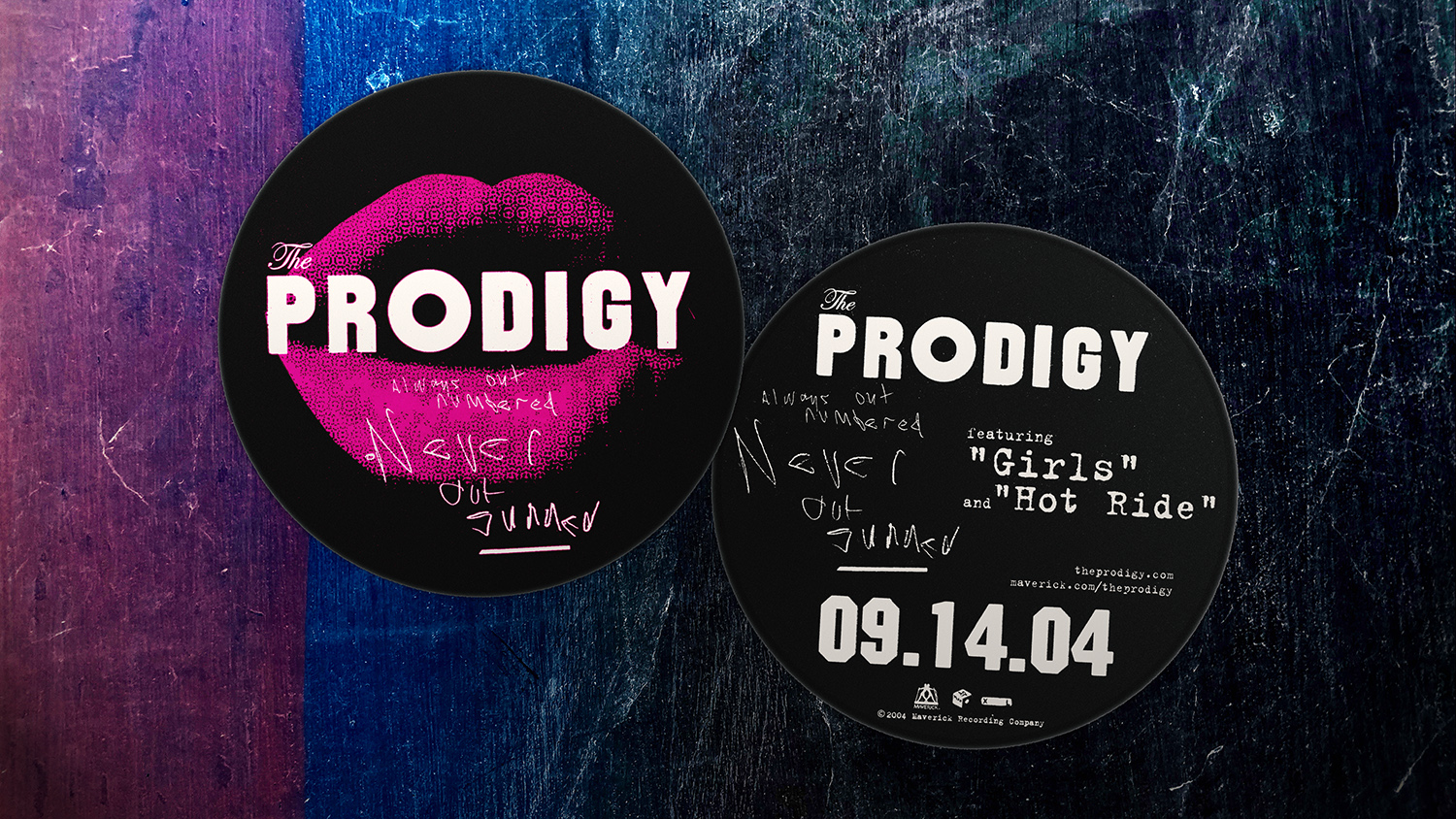
In the States, the album was released later than anywhere else: the Maverick label, which had been the band’s home in America since 1997, dropped the album on 14 September 2004. Special stickers with a unique design were issued to promote the release.
Intro UK for All Souvenirs: This is one of our all time favourite pieces of work. The quality of the end product reflects the quality of the client and our relationship with them. Thank you Prodigy.
As well as the cover of ‘Always Outnumbered, Never Outgunned’, Intro also worked on the design of the single Girls and its music video, which we covered in detail in our special article on that track. It is worth noting that the other two covers from the same period (Hotride and Spitfire) are missing from Intro’s portfolio, — and there is no mention of the designers in the singles’ credits as well. The bottom line is that after creating the album artwork and promo campaign for the Girls single, the Intro team never worked with The Prodigy: apparently the XL Recordings designers created the artwork for the last two singles of the era on their own, in keeping with the style and spirit of the album.
All Souvenirs: And what about ‘Hotride’ and ‘Spitfire’?
Anna Bergfors: They certainly were not ours. After two versions of the ‘Girls’ video I think the record company did them in house. Something like that, it was indeed a while ago.
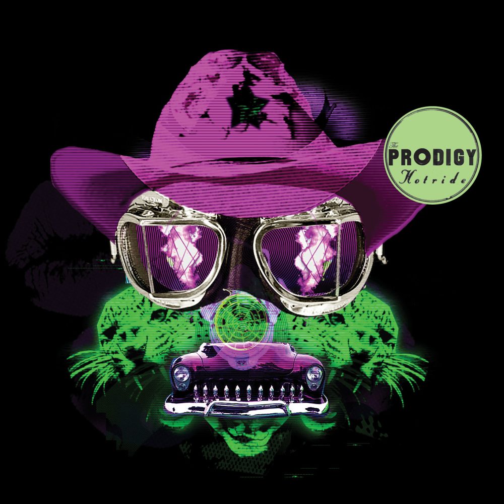
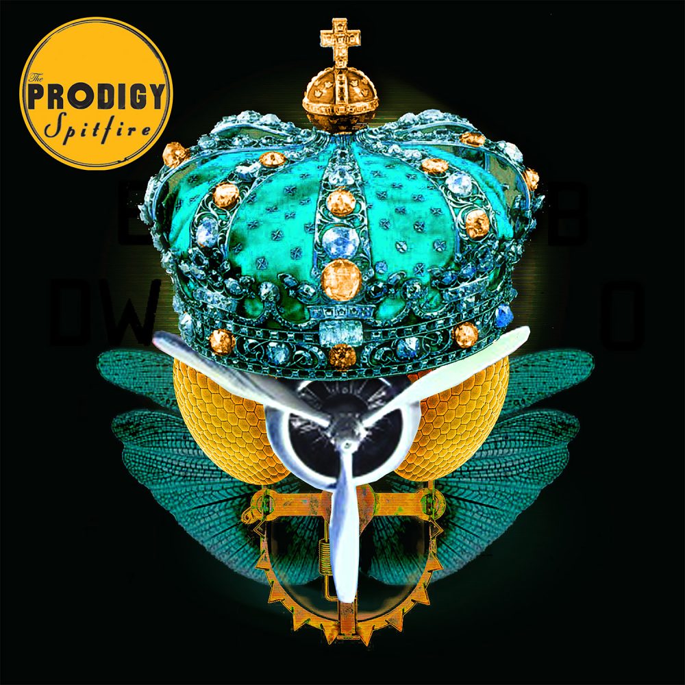
Designed in house by XL Recordings
Headmaster: SPLIT
Additional thanks to: Anna Bergfors, Nikki Hildesley, Intro UK
Donate

 Tether (USDT)
Donate Tether(USDT) to this address


YOOMONEY (RUS): 7928З82272З